PrintReleaf
Design System
Reducing inconsistencies in UI components by 90%

PrintReleaf makes printing more sustainable by measuring companies paper consumption and automatically replant trees to replace it.

The Team
VP Product & Technology
Product Designer
Two Software Engineers
My Roles
Sole designer responsible for:
Creating the first design system and redesigning the product’s entire visual language (typography, color, spacing, iconography, accessibility).

Problem

PrintReleaf was in need of a complete redesign of their product. Before my involvement, the team had no formal design system—only fragmented UI decisions made directly in code. This led to:
  • Inconsistent user interface elements
  • Slower development times due to duplicated or improvised styles
  • Difficulty maintaining a cohesive brand experience
  • No shared language between design and engineering
  • Many UI elements failed to meet basic accessibility standards
  • The site was designed primarily for desktop, leading to inconsistent performance across devices and screen sizes

Solution

We decided to build a component-based design system leveraging Tailwind UI as the foundation for both design and engineering. My goal was to:
  • Establish a new shared visual language
  • Design a complete component library in Figma, mapped directly to Tailwind classes
  • Define tokens that matched Tailwind’s system (e.g., colors, spacing, radii, typography)
  • Implement accessibility best practices (WCAG AA)
  • Create a scalable foundation for future features
  • Build responsive components to ensure usability and visual consistency on all screen sizes

Competitive Analysis

Before building, I analyzed design systems from industry leaders including:
  • Linear Design System
  • Atlassian Design System
  • Untitled UI - Jordan Hughes
  • Material Design
  • Figma Community
Wix logoSquarespace logoMailchimp logoGoogle Forums logoGoogle Forums logo

Engineering & Collaberation

I collaborated closely with the Head of Engineering to translate the design into code following Tailwind UI.
    • Colors: Used Tailwind’s default palette (with some custom extensions)
      → primary: colors.grean.600
    • Tokens: A shared token map in Figma and in Tailwind config to ensure parity across design and code.
    • Spacing / Sizing: Stuck to the Tailwind 4px scale
      space-sm, width-md, etc.
    • Shadow / Elevation: Adopted Tailwind’s shadow-sm, shadow-md values for hierarchy
    Primitive variables from FigmaToken variables from FigmaSizing variables from Figma

    Final Results

    Together with engineering, we spent months building a scalable design system that supported consistent UI patterns, faster development cycles, and long-term maintainability
    • Reduced inconsistencies in UI components by 90%
    • Set a scalable visual foundation for the product’s MVP and future growth
    • Established a single source of truth for both design and engineering
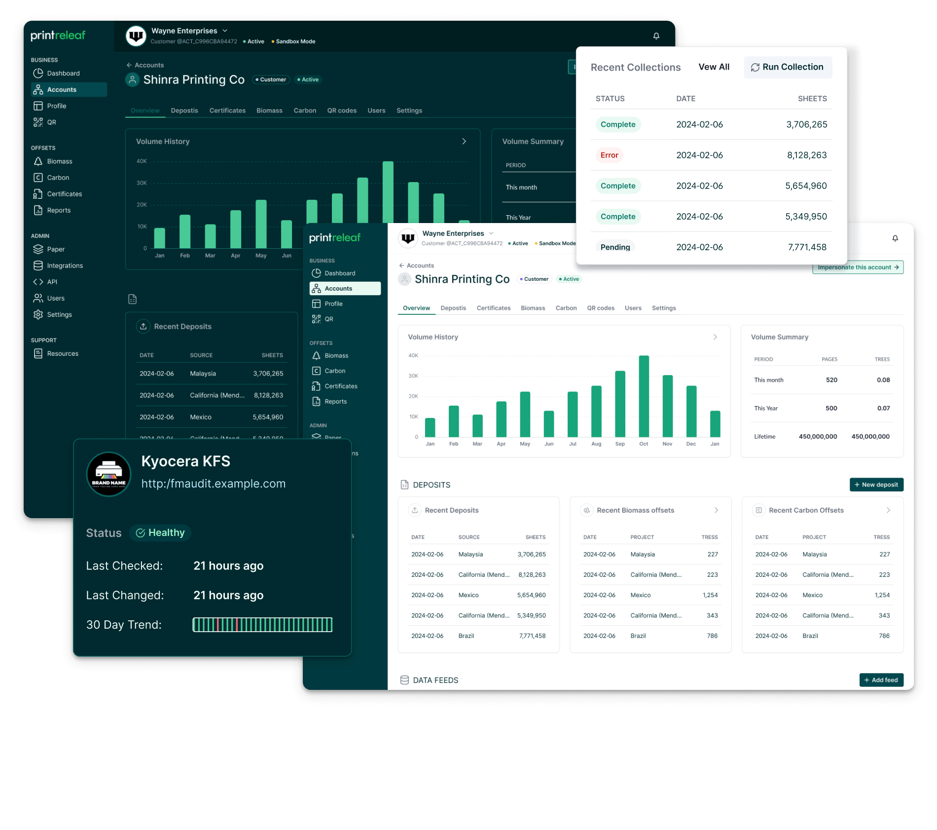
    • Improved site accessibility to WCAG 2.1 AA standards, confirmed via automated and manual audits using Lighthouse
    • As we grow, new designers and developers will benefit from:
      - Clear documentation
      - Pre-built, reusable components
      - Design-to-code parity
      - Built-in accessibility standard

      Learnings & Takeaways

      I love working on design systems; they’re the perfect mix of design, collaberation, problem-solving, and organization. I get to be like Marie Kondo and bring clarity, consistency, and a little spark of joy.
      • Close communication between design and engineering is key. Get ready for a lot of back and forth for designer–developer alignment
      • A thoughtful token strategy takes work, but pays off in dark mode
      • Established a single source of truth for both design and engineering
        Let's Get In Touch
        Contact Me